“POSH PLUM”

Totally Heart Events is honored to be asked to design a table at a charity event this year.  The 2012 Trace3 Table for 10 Culinry Event benefited Project HOPE Alliance which supports the homeless children in Orange County, CA.  The event took place the elegant the Balboa Bay Club & Resort in Newport Beach, CA.  Roy’s Restaurant Newport Beach was a part of this great event again this year.

We were asked to create a table that represents the elegant yet laid back dining of Roy’s.  To start off – Roy’s signature colors are plum purple and sage green; however,  I want to do a more modern color combination at this event so I thought I would draw from their newly designed logo of the silver koi fish named “Guchi” and the signature plum “Roy’s” logo instead.  The color scheme was plum purple, gray, white, and a dash of shiny silver.  Below is the board I came up with…

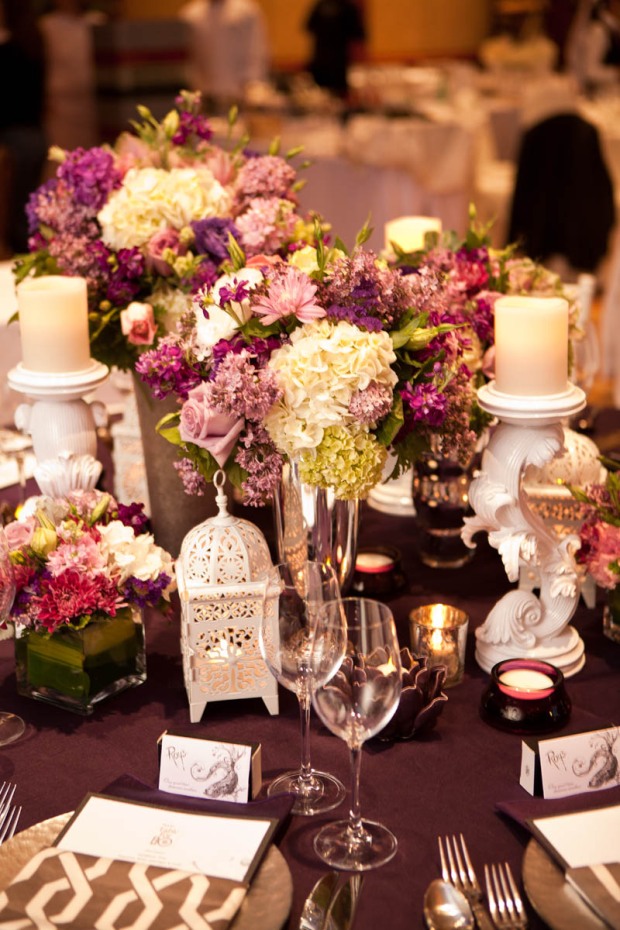
The table we were given was round table, which I find a bit more challenging to work with…but it worked out after I decided to arrange everything into 3 groups so everyone gets a “good” angle of the table decor.  This is how the table turned out…

We chose 3 different type of silver vases with different textures and finishes to hold the flowers, which I think give the design a bit of an eclectic look.  KC Floral Designs did the flowers for us again, and they turned out beautiful.

My most fabulous find must be these candle holders from Z Gallerie.  The design reminds me so much of Roy’s signature koi fish, Guchi.  I couldn’t believe I found them for just $19.95 each!

The white Casablanca lanterns (also from Z Gallerie) added some whimsy and a beautiful glow to the table.  The deep plum lotus votive holder (Z Gallerie) is a classic Roy’s style so I had to add that to the table.

And another element that I love is the silver graphic print napkins.  I made those myself from a panel of curtain!

And here are some pictures of the delicious food that E created.  The cauliflower soup looks great against the silver charger.

Here’s E working hard plating the main entree table-side…

I didn’t get to taste everything, but I did get a sample of the Nutella Macarons that were served…and they were to die for!

We had such a wonderful time setting up for this great event and  hope we get to do another one soon!

Photos: Courtesy of Bob Hodson Photography, Styles Photography, and yours truly.

“MAD ABOUT [FABULOUS FUSCHIA] MONDAY”

I’m dedicating this week to blog about all things I’m currently obsessing with right now…and hopefully, these items will also transition beautifully into the Spring.  First off…anything fuschia.

Let’s be honest…when is pink ever not in fashion?  As Elle Woods once wisely said, “whoever said orange was the new pink was seriously disturbed.”  Well said, Elle.

My pick for pink…these B for Brian Atwood suede pumps.  Amazing, right?  If you could remember a few posts back, I was obsessing about these before X’Mas.  I guess Santa was listening and wish granted on X’Mas day :-).  My poor neighbors were probably thinking someone got hurt judging by the sound of my scream when I opened the box.  E, which from now on will be referred to as the best husband in the world, searched every store in the nation scouring for my exact size as apparently these were sold out everywhere during X’mas.  Luckily, someone returned my exact size while he was at the store.  I’m in love…

Images: 1 and 2. Yellow Weaver, 3. The Glitter Guide, 4.  I Dream of Shoes, 5 and 6. My own

“TREND TUESDAY [NON-TRADITIONAL GIFT WRAPPING]”

…it’s the season of giving…and I couldn’t be more excited!  I have this weird obsession with beautiful wrapped gifts…especially if they are wrapped with unusual materials…preferrably something recycled or something that can be found around the house.  I’m a firm believer that beautiful-wrapped gifts do not equal expensive papers, ribbons, and bows.  I see more and more non-traditional materials used for gift wrapping and toppers and just want to share some of my faves from the craft queen, Martha.

These gifts were wrapped with simple crepe papers that we normally use for party decor.  These crepe papers are super cheap, and they work beautifully as a ribbon alternative.

This set of gifts is wrapped with inexpensive tissue papers and glassine papers weaved into a cool pattern.

This set was wrapped with simple knitting yarns.  I can see endless possibilities with this because yarns come in so many colors and textures.  So much fun!

These are definitely my favorite.  Simple cupcake liners are re-imagined as beautiful flower toppers.

And who doesn’t love a personalized gift wrapping?  It would be so fun to give a gift with a picture of the giver+recipient.  Photobooth photos would be great for this.

Lastly, no ribbons…no problem.  Just take pieces of paper and make your own ribbons.  A little imagination can go a long way.

I hope this inspire you to come up with some fun ideas when wrapping gifts.  So the next time before you spend money on that fancy gift bag, take a look around the house and see how creative you can be :-).

Happy Wrapping~

Images: Martha Stewart

“ALLSAINTS”

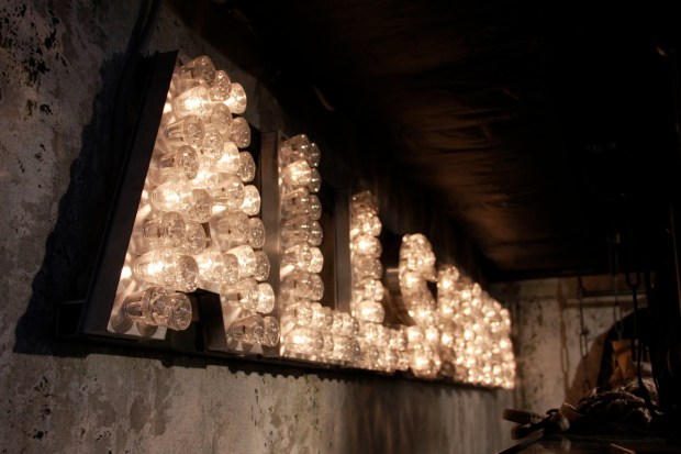
…I LOVE this store!  So so much I don’t even know where to begin.  I always want to buy EVERYTHING in there.  It’s so edgy and cool, a bit rock n’ roll, a bit avant-garde, and a bit bohemian – all roll into one store.  I love this store so much I feel obligated to take photos every time I’m in it.  So awesome!

These photos are from the AllSaints store inside Harrod’s in London…

This is the gigantic store front of the AllSaints store in downtown Chicago…

These next two were taken at the one inside Bloomingdale’s at South Coast Plaza…which I frequent because it is literally 2 minutes from my house.

I got this super cool Melody dress from the store this past summer…

I’m in love with the leather and buckle details contrasting with the crisp, white cotton.  It is very well constructed with the fitted bustier-like top (but not restrictive at all because it has no boning) and a layered but light bottom.  I have to admit…it is a bit of a pain to take care off.  It is IMPOSSIBLE to iron/steam this dress on my own because of the folds and layers of the skirt…so it is dry-clean only.  But it looks so fabulous on…who cares!

I wish I have a good picture of the dress on, but I only have bits and pieces of the dress from different angles.  I mainly want to show the pretty bustier-like top and how the skirt looks on…

As much as I love the dress, my most favorite AllSaints purchase of all time has to be these leather sandals.  I first fell in love with how the sandals look…but I must say, they are so comfortable on!  When I say “comfortable,” I mean I’m able to walk around town in them for an entire day…and not be in pain.  It’s so hard to find a pair of fab yet comfortable shoes, and these are it!

My next purchase…one of these sparkly pieces.  AllSaints make the best beaded items whether it be a dress or a skirt.  I have been eyeing them for quite some time, and I just can’t wait to own one…

Love, love, love~

Images: My own, Adventures of Styles, and All Saints

“MAD ABOUT [CHEVRON PRINT] MONDAY”

I’m back doing “Mad About […] Monday” yay!  It’s been so long, but I’m inspired to write this post today because I saw this…

and this…

They remind me of how fun, fresh, and modern this particular print can be.  I have been obsessed with the zig-zag chevron print for a while, but I didn’t notice how crazy I was about it until I looked through my album from the summer and found all these photos!

Kicking off the summer with chevron pedi.  I have the best manicurists EVER!  Vanna and her sister, Valerie, are awesome.  In fact, I’m going to blog about all the cool mani/pedi they have done for me soon…

It wouldn’t be a summer without a chevron print bikini.  This set is from H&M, and it is still my favorite so far…

…rocking it at my b-day bash at the SLS pool this past summer…

And of course, I was one of those crazy people at Target when the Missoni-Madness was happening…

I scored these Alexa rugs for my living room from Overstock.com.  I couldn’t order a large enough rug because it was out of stock at that time so I ordered 2 small ones and put them side-by-side.  I think they may be back in stock now!  If you are looking for one, hurry before they are out again.  I totally love them!

And my favorite designer of all time, Jonathan Adler, came out with this iPhone case…I was beyond excited…

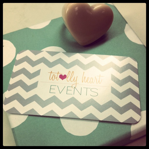
Lastly, when it was time to choose a design for Totally Heart Events business cards…we chose chevron.  It’s totally US!  My dear friend, Nikki, from The Collection Design Studio (who did our wedding invitations) was the creative genius behind this design.  Isn’t it so lovely?

So I think it’s clear that the zig-zag is here to stay for a while…at least for me.

Love~

Images: 1. Ada & Darcy, 2. Aletafae, Rest of Photos – my own via Instagram

“THE PERFECT ‘PEAR’ REHEARSAL DINNER” PART III

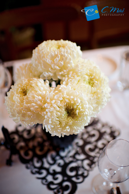
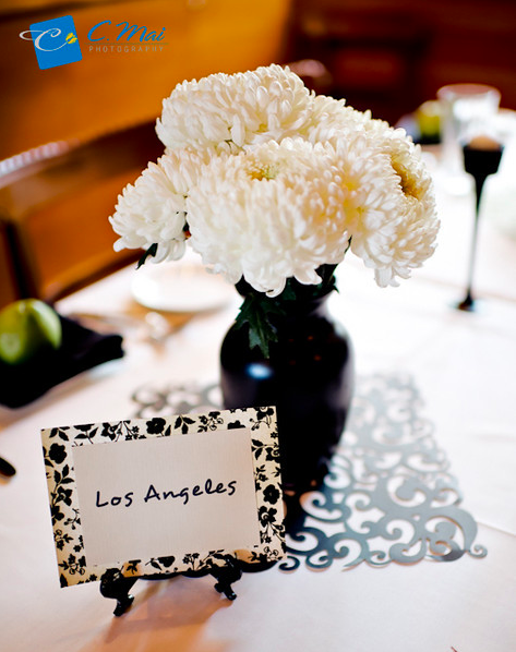
We finally get to the “Black” element of this party.  I had envisioned super glossy, black vases with pure white blooms in them.  I thought the contrast will be super modern, and since we are try to keep everything simple, modern is the best way to go.

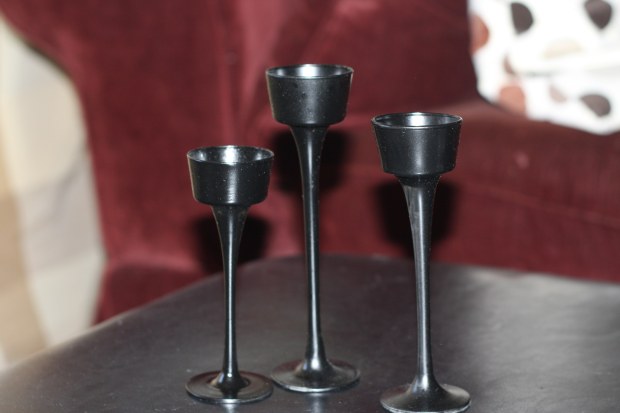
We purchased cheap vases and candle holders from the Dollar Store.

We then spray-painted them with a glossy black paint.

Sadly, they didn’t turn out as glossy as I would have wanted them to be, but they still work out great in the end.

We then purchased bunches of white/ivory blooms from a local flower wholesaler.  We got China Mums, Gerbera Daisies, Lisianthus, Tulips, Hypericum (which I think look like mini-pears…so cute) and some other really pretty flowers that I don’t know the name of :-(.  I really must educate myself more on flowers…

The key to make this minimalistic approach work is to stick to just black and white/cream palette.  This palette just make everything looks so clean and elegant.  To display them, we bought these laser cut scrapbook papers.  We used them as the “mat” to display the flowers on and to give the table another visual layer.

We originally wanted to make table runners, but our budget and time-constraint did not allow for that so we went with the mat idea instead.  I actually did the same trick before at my bridal shower, which worked really well so we did the same here.

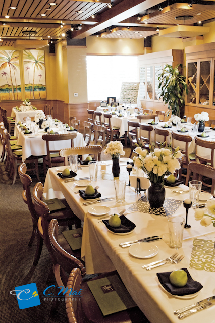
And here’s how the room turned out….

Cheers to the Perfect “Pear”~

Images: Me and C. Mai Photography

“THE PERFECT ‘PEAR’ REHEARSAL DINNER” PART II

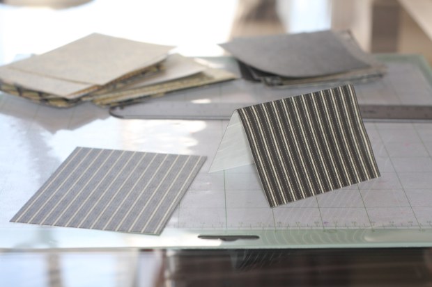
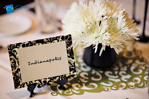
For the escort cards, we were able to find these cute, patterned scrapbook papers in a smaller than standard (12×12) size at Joann, and luckily, they were perfectly in our color scheme as well.

Each piece is perfect for 2 escort cards when cut in half.

We halfed each paper then folded each piece in half again so each card will stand up on its own.

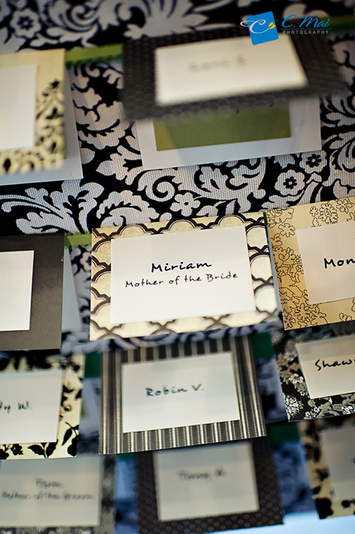
We then printed each guest’s name on ivory papers.  Cut out each name and glued it to the outside of the card.  As for the inside, we printed each table’s name on green papers and glued it to the inside of the card.  So simple, yet so pretty.

As for the table names, we used the same patterned scrapbook papers as the escort cards, but instead of halfing each one, we used the entire sheet.  We also printed each table’s name on an ivory paper then just glued it onto the patterned paper.  We then displayed  each one on a photo stand (recycled from my wedding.  I ❤ recycling!).

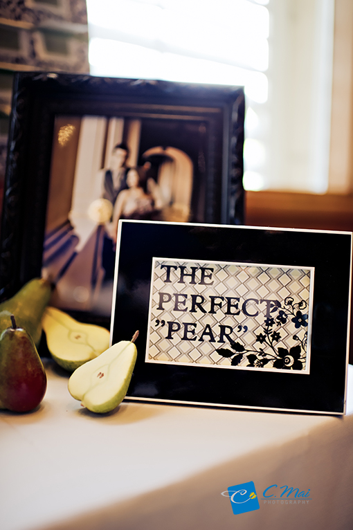
We also made the signs “The Perfect ‘Pear'” and “Please Take a Seat” with the help of the Cri-Cut machine.  We simply cut the words out with the Cri-Cut on a scrapbook patterned paper then we added a plain, opposing color paper in the back so the words show.  We then framed them for the Escort Cards Table.

As previously mentioned, we tried to keep everything as simple as possible so purchasing already pretty, patterned papers saved us a lot of time.  So my advice is to always be on the lookout for pretty scrapbook papers on sale.  They save so much time and energy, and they can add so much characters to your event.

Up next – The “Black” element of this party.  Stay tuned!

Images:  By me and Courtesy of C. Mai Photography

“THE PERFECT ‘PEAR’ REHEARSAL DINNER” PART I

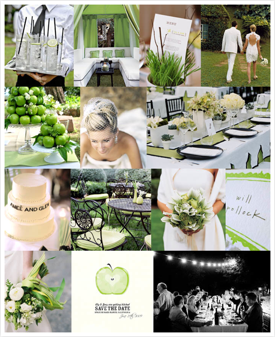
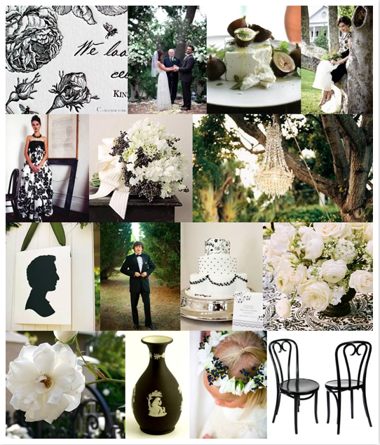
…since we were asked to take this dinner on (super) last minute, I didn’t come up with my own inspiration boards.  Instead, I went to the Queen of Inspiration Boards, Kathryn of Snippet and Ink and just picked a couple of them out for this dinner.  We decided on a modern palette of black, cream, and “pear” green for our Perfect “Pear” theme.  It is always a bit hard to design around a pre-existing color scheme, in this case, a restaurant, but we made the most of what is there.  The restaurant’s table clothes are cream, and they were able to provide us with black napkins so we chose to bring in green and work around that.  Here are the boards that inspired this dinner…

Because of the budget and time-constraint, I decided to keep all projects a simple as possible but still make a big impact in the room.  The biggest showpiece for this event is the Escort Cards Display.  We chose a Black & Cream Damask fabric and wrapped it around a simple foam board.  Here’s how we did it:

Start with a large foam board.  The one we used is 24 in. x 30 in. for 45 escort cards.  This can be purchased at any craft store.

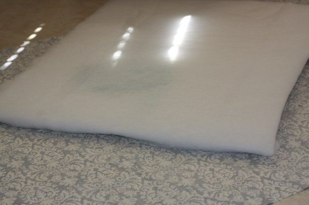
We also bought a roll of batting from Joann’s.

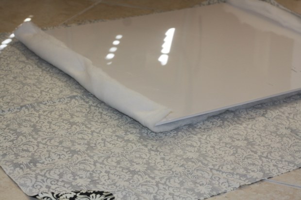
We then wrapped the batting around the foam board.  You can glue the batting to the foam board using a spray glue, but since we didn’t have any, we just used glue gun.

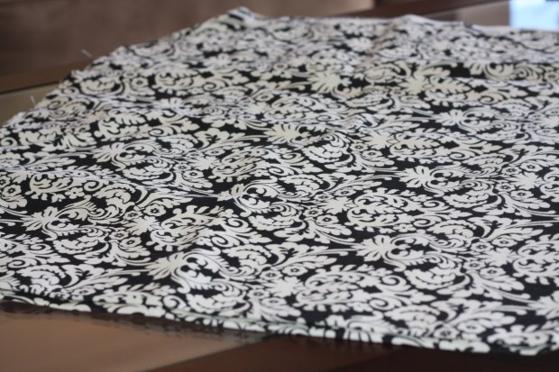
We purchased a patterned fabric a little large than the foam board.

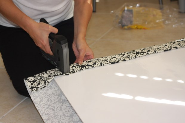
We then wrapped the fabric around board.  Make sure to pull it taut and then glue the back side.  You can also staple the fabric to the board to be more secure.

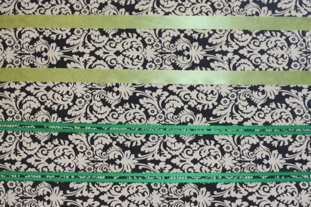
We then use green ribbons in different shades of green to wrap around the board.  This is where you’ll tuck in the escort cards.

We were having some trouble getting the ribbon to stay taunt so we ended up using thumb tags to help re-enforce the ribbons by tagging them directly into the back of the foam board.  This method worked the best – although it doesn’t look pretty in the back, but our board will be leaning against the wall so it worked fine for us.
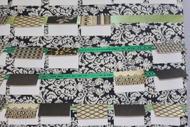
And that’s it for the board.  Super easy.  This is the finished product…

Up next – the  paper projects (escort cards, table names, and signs).

Images:  1,2 Snippet & Ink, and the rest of photos – me.